

White space is not unused space. It is one of the strongest tools in a designer’s kit: it separates ideas, sets pace, directs attention, and gives people a moment to understand what they see.
When a website feels premium, easy to read, or unexpectedly calm, the difference is often not more decoration. It is better space. Here is how to use it with intent.
White Space Is an Information Tool, Not a Decoration
White space—also called negative space—is the empty area around text, images, controls, and sections. It is what stops a page from becoming a wall of equally loud information.
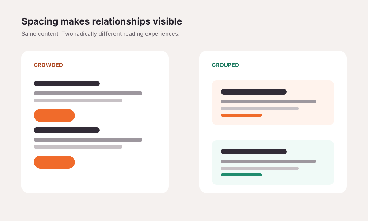
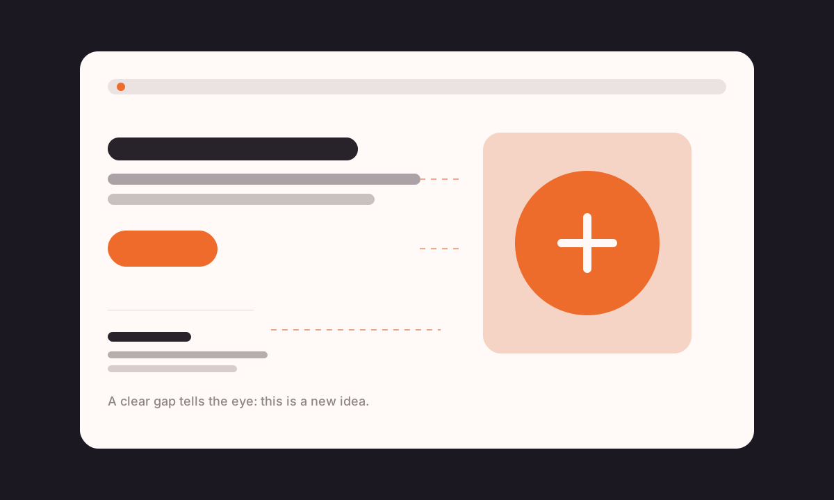
People use gaps to infer meaning before they read. A label placed close to an input feels connected. A large gap after a section says, “that idea is complete.” A quiet area around a button makes that action easier to notice. In other words, spacing is part of your interface language.
Think in Two Layers: Macro and Micro White Space
Macro white space is the breathing room between major page regions: the hero, proof points, product features, testimonials, and footer. It helps a visitor scan the story of the page without feeling rushed.
Micro white space is the finer spacing inside components: letter spacing, line height, label-to-field distance, padding inside a button, and gaps between cards in a row. It makes the details feel deliberate.
- Use macro space to separate decisions and sections.
- Use micro space to make a component easy to read and operate.
- Keep the relationship consistent: tighter inside a group, looser between groups.
A useful rule: if two things belong together, make their gap smaller than the gap to the next group.
Space Creates Hierarchy Before Colour Does
Design teams often reach for a stronger colour, a heavier border, or a bigger heading to create emphasis. Those tools can help, but space is usually the cleaner first move. A generous margin around a key message gives it weight without making it shout.
This is particularly helpful on marketing pages and dashboards where everything seems important. Instead of adding a card around every block, give the primary story more room and let supporting detail sit closer together.
Better Reading Starts With Room Around the Words
Dense copy is not only a content problem. When line height is tight, paragraphs are too wide, and headings touch the text below them, readers have to work harder just to keep their place.
- Keep body text comfortably sized and give it generous line height.
- Limit line length so the eye can find the next line without losing its rhythm.
- Put a smaller gap between a heading and its paragraph than between two separate sections.
- Use empty space around important images so they support the story instead of interrupting it.
The result is not simply a page that looks cleaner. It is a page that respects a visitor’s attention.
White Space Helps People Act With Confidence
A crowded layout forces people to search. A clear layout gives them an obvious place to start. By isolating the core value proposition, pricing choice, form field, or checkout summary, you make the next step feel less risky.
That does not mean every CTA needs to float alone in a giant empty area. It means the action needs a distinct visual neighbourhood: enough separation from competing elements, clear supporting copy, and a predictable place in the flow.
Build White Space Into Your Design System
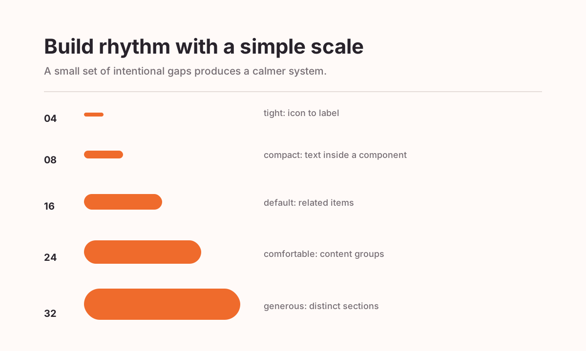
The fastest way to lose visual consistency is to decide spacing by feel on every screen. A simple scale gives the team a shared vocabulary. Start with a base unit—often 4 or 8 pixels—then create a small set of steps such as 4, 8, 16, 24, 32, and 48.
- Use 4–8px for tiny relationships such as icon-to-label or badge padding.
- Use 16px for related content within a card or form group.
- Use 24–32px between related component groups.
- Use 48px and above to separate major sections or shifts in task.
- Document the intent, not just the number: “section gap,” “card padding,” “field group.”
The exact values can change with your brand and viewport. What matters is the visible rhythm: people should sense structure without consciously measuring it.
Four Common Mistakes to Avoid
- Using one gap everywhere: equal spacing flattens hierarchy because nothing feels more closely related than anything else.
- Adding containers instead of space: too many borders and card backgrounds create visual noise. Try separation first.
- Forgetting mobile: space has to work at narrow widths too. Preserve hierarchy, then tighten values thoughtfully.
- Treating the fold as a packing challenge: a bit more scrolling is often better than cramming the first screen with competing ideas.
A Quick White Space Checklist
Before you ship a page, use this five-minute review:
- Can someone identify the primary action at a glance?
- Are labels closer to the controls and content they describe than to neighbouring groups?
- Do section gaps feel larger than internal component gaps?
- Can a reader scan headings, paragraphs, and images without feeling visually tired?
- Does the layout still feel clear at mobile sizes, with real content and error states?
Frequently Asked Questions
Does white space make a website look empty?
No—if it is purposeful. Empty layouts lack a story or useful content; spacious layouts give important content the room it needs to be understood.
Should every section have the same amount of space?
Not necessarily. Repeated base values create rhythm, but major transitions and high-priority moments may need more room. Let the relationship between content determine the gap.
Can white space improve conversion?
It can reduce decision friction by making the message, proof, and next action easier to notice. It works best alongside clear copy, accessible contrast, and a focused user goal.
Make Space Do Some of the Explaining
The best layouts do not make people fight for clarity. They use space to organise the page, protect attention, and turn a sequence of elements into an understandable experience.
Start small: loosen a crowded form, separate two competing actions, or introduce a consistent spacing scale. Those quiet changes often do more for usability than another visual effect ever could.