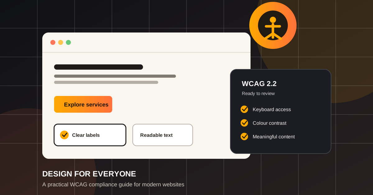


An accessible website is not a smaller version of a great experience. It is a great experience that more people can use: people navigating with a keyboard, using a screen reader, viewing a phone in bright light, recovering from an injury, or simply trying to complete a task quickly.
WCAG gives teams a shared standard for that work. The real goal, however, is more human: make every important journey clear, operable, and dependable for the widest possible range of visitors.
What WCAG Compliance Actually Means
The Web Content Accessibility Guidelines (WCAG) are internationally used recommendations for making web content more accessible. They cover design, content, code, interaction, and compatibility with assistive technology. WCAG 2.2 is the current version most teams reference when planning new work.
Conformance is measured at three levels: A, AA, and AAA. Level AA is the practical target for most public-facing websites. It requires deliberate design choices, but it does not require a separate “accessible version” of the site. The most durable approach is one inclusive experience.
Use POUR as Your Design Lens
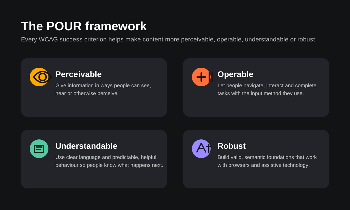
WCAG is easier to use when you group its requirements around four questions. Can people perceive the information? Operate the interface? Understand what is happening? And rely on the technology to work with their browser or assistive tools?
1. Start with Meaningful Structure and Content
A screen reader does not see your layout. It reads the semantic structure behind it. Use a single, descriptive h1, then organise ideas with logical heading levels. Prefer native buttons for actions and links for destinations. When the element already exists in HTML, using it usually gives you keyboard and accessibility behaviour for free.
Content design matters just as much. Write specific link text such as “Download the accessibility checklist” instead of “Click here.” Describe the purpose of a form field before someone enters information. Keep instructions next to the control they explain.
<button type="button">Save changes</button>
<a href="/pricing">View pricing plans</a>
<label for="email">Work email</label>
<input id="email" name="email" type="email" autocomplete="email">
2. Make Every Important Task Work with a Keyboard
Many visitors do not use a mouse all the time, or at all. A keyboard user should be able to reach menus, filters, dialogs, form fields, and calls to action in a predictable order using Tab, Shift + Tab, Enter, Space, and arrow keys where appropriate.
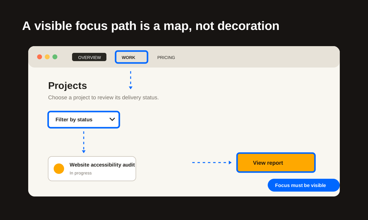
- Keep the visual focus indicator obvious on every interactive element; never remove it without a stronger replacement.
- Match keyboard order to the visual reading order, especially in complex cards, modals, and responsive layouts.
- Include a “Skip to main content” link as the first focusable element for long pages.
- When a dialog opens, move focus into it; when it closes, return focus to the control that opened it.
- Do not create keyboard traps: users must always be able to move away from an element.
3. Design for Contrast, Not Just Brand Colour
Colour can support meaning, but it cannot be the only way meaning is communicated. A red field alone does not adequately explain an error; pair it with clear text and an icon or status label. Likewise, charts and filters need labels, patterns, or shapes in addition to colour.
For normal-size text, aim for a contrast ratio of at least 4.5:1 against the background. Large text has a lower threshold of 3:1, and non-text controls need enough contrast to be identifiable. Check every state: default, hover, focus, selected, disabled, error, and dark mode.
4. Build Forms That Explain, Prevent, and Recover
Forms are often where an otherwise accessible site breaks down. Each field needs a visible label, not placeholder text alone. Required fields should be identified before submission. If an error occurs, say what happened, where it happened, and what the visitor should do next.
- Use persistent labels and helpful examples for formats such as dates, phone numbers, and passwords.
- Group related inputs with
fieldsetandlegend, such as a delivery preference or payment method. - Connect inline errors to the related field and provide an error summary after submission when needed.
- Preserve entered information after a validation error whenever it is safe to do so.
- Use clear action labels: “Create account” is more helpful than a generic “Submit.”
5. Treat Images, Media, and Motion as Content
Every meaningful image needs alternative text that conveys its purpose in context. Decorative images should use empty alt text so screen readers can skip them. For complex visuals such as charts or process diagrams, provide a short summary and a nearby detailed explanation in the page content.
Provide captions for prerecorded video, transcripts for audio, and audio description when important visual information is not already spoken. Avoid auto-playing media. For animation, respect the visitor’s reduced-motion preference and never use flashing content that could trigger a seizure.
6. Test the Journey, Not Only the Page
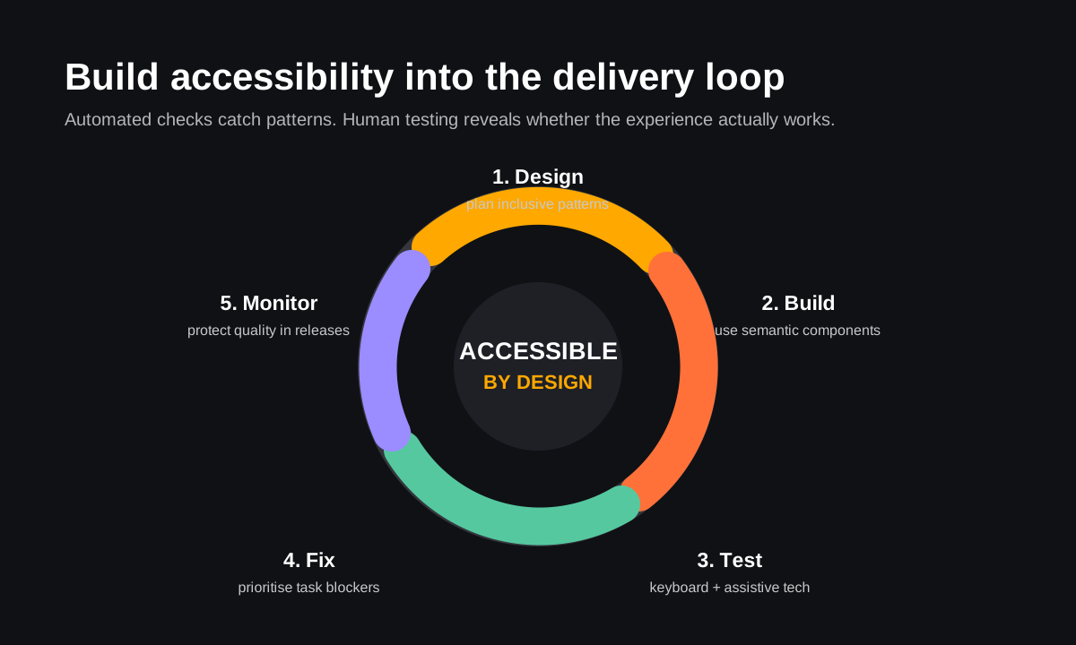
Automated tools are useful early warnings, not a compliance certificate. Combine them with manual checks on the paths that matter most: finding a service, filtering results, signing up, booking, checking out, and contacting your team. Test with real content, zoomed text, a keyboard, and at least one screen reader.
- Run an automated scan to catch common issues such as missing labels, invalid heading order, and weak contrast.
- Tab through each key journey without touching the mouse. Check focus order, visibility, and dialogs.
- Zoom to 200% and check that content remains readable, usable, and does not require horizontal scrolling on common widths.
- Use a screen reader to review headings, landmarks, links, images, forms, and dynamic error messages.
- Include disabled people in usability research whenever possible; lived experience finds problems a checklist can miss.
7. Make Accessibility a Team Habit
The best accessibility outcomes come from shared ownership. Content teams write concise labels and useful alternatives. Designers define focus, error, contrast, and responsive states. Developers use semantic components and test interaction. Product teams make inclusive outcomes part of the definition of done.
Capture your decisions in the design system. A documented button, input, modal, alert, and data table is easier to use correctly across projects than a one-off fix. Add accessibility acceptance criteria to tickets so it is planned and reviewed alongside performance, analytics, and visual polish.
WCAG-minded pre-launch checklist
- Every page has a descriptive title, one clear
h1, and logical heading hierarchy. - All important tasks work with keyboard-only navigation and show a visible focus indicator.
- Text, controls, and status messages meet contrast needs in every relevant state.
- Links, buttons, inputs, and errors have names that explain their purpose.
- Images have appropriate alt text; video has captions; audio has a transcript.
- Layouts work at 200% zoom and on narrow screens without losing content or controls.
- Automated checks and manual keyboard/screen-reader tests have been run on core journeys.
- Accessibility issues have an owner, a severity, and a plan for follow-up after launch.
Final Thoughts
WCAG compliance is not about making a website feel constrained. It is a way to make the product clearer, more resilient, and more welcoming. When semantic structure, visible focus, readable contrast, helpful feedback, and thoughtful testing become normal parts of your process, accessibility stops being an emergency fix.
Start with the one journey that matters most to your visitors. Make it work well without a mouse, without colour alone, and without assumptions about how someone consumes content. Then repeat that standard across the system.
Frequently asked questions
What WCAG level should a business website target?
For most public-facing websites, WCAG 2.2 Level AA is a practical and widely expected target. It addresses many common barriers while remaining achievable for product teams.
Can automated tools make a website WCAG compliant?
No. They help find repeatable technical issues, but they cannot judge clear language, meaningful alt text, reading order, or whether a keyboard user can complete a real task. Manual testing is essential.
Is accessibility only a developer responsibility?
No. It is shared by product, content, design, research, and engineering. The most efficient work happens before code, when inclusive needs influence the brief and the interface.