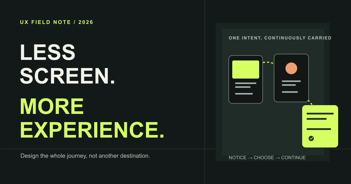


The next leap in user experience will not come from adding a screen to every moment. It will come from making the moments around a product feel more connected: finding the right information, making a decision, getting help, recovering from a mistake, and knowing what happens next.
Screens still matter. They are simply one part of a much larger experience that also includes people, services, policies, physical spaces, notifications, and the gaps between them. The design opportunity is to make that whole journey feel clear and coherent.
This is a practical guide to shifting from screen-first thinking to experience design: how to map a journey, decide when an interface is useful, carry context responsibly, and measure whether the experience actually got better.
What “Beyond Screens” Really Means
A screen is a container for interaction; an experience is the progress a person makes over time. Booking a service, for example, may begin with a search, continue through a comparison, move into a conversation, and end with an appointment and a useful follow-up. The person thinks of that as one job, even if several teams and channels are involved.
Designing beyond screens means taking responsibility for the joins: what someone already knows when they arrive, how they move between steps, where they can get help, what the business does behind the interface, and whether the outcome matches the promise.
It does not mean hiding interfaces, removing controls, or treating automation as inherently better. A well-designed screen can be the clearest and most respectful way to help. The question is whether that screen moves the person forward in context.
Why More Screens Stop Helping
Digital products tend to turn every new need into another destination: a dashboard, settings page, onboarding step, status panel, or assistant. Each can solve a local problem. Together, they can leave people navigating the product instead of completing their task.
- Fragmented intent: people repeat their goal as they move between forms, teams, and tools.
- More choices without more clarity: another menu can increase work without helping someone decide.
- Context gets stranded: progress made in one channel disappears at the next handoff.
- Maintenance multiplies: extra states, screens, and rules create more chances for an experience to drift.
A screen count is not a quality metric. The better question is whether people can understand the situation, make a confident choice, and reach the outcome without avoidable effort.
Design Around the Whole Journey
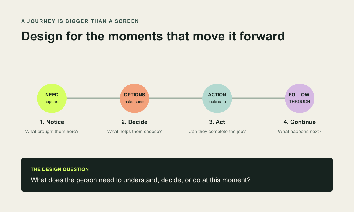
Start with the person’s goal, not the product map. Describe what they are trying to accomplish in plain language, then follow the journey from the trigger through the outcome and what comes after it.
For each moment, note the person’s question, the information they need, the action available, and what the organisation must do in response. Include the backstage steps too: a staff review, inventory update, eligibility check, delivery, or support handoff may shape the experience as much as the visible UI.
A useful journey map is not a poster of ideal steps. Mark uncertainty, waiting, repeated work, failures, and workarounds. Those are often where the next design opportunity becomes visible.
Five Principles for Better Experiences
1. Begin with a meaningful outcome. Write down what success looks like from the person’s point of view. “Submit the form” is a system event; “know whether the project is a fit and what happens next” is an experience outcome.
2. Put information where the decision happens. Bring price, availability, requirements, reassurance, and consequences close to the choice they explain. Avoid sending people elsewhere to assemble their own answer.
3. Preserve progress. Save work at sensible points, make changes recoverable, and do not make people repeat information the service already has permission to use.
4. Make the next step legible. Tell people what just happened, what is happening now, and what they can do if the expected result does not arrive.
5. Make flexibility feel consistent. A person may switch between touch, keyboard, voice, a phone call, or in-person help. Keep the language, status, and rules recognisable across those routes.
Choose the Right Touchpoint, Not the Newest One
Not every interaction needs an app screen. A clear email may be best for something people need to revisit. A live conversation may be better for a high-stakes or ambiguous decision. An in-product status may be enough when someone only needs to know that work is underway. Sometimes the best interaction is removing a step entirely.
Choose a touchpoint by the job it needs to do, the environment the person is in, the sensitivity of the information, and the cost of getting it wrong. Voice can help when hands are busy, but it is a poor default in a quiet shared office or when someone needs to compare several options. A notification can restore continuity, but it should not turn every update into an interruption.
- Use a visible interface when people need to inspect, compare, edit, or control detail.
- Use a short notification when a timely change affects the next decision.
- Offer a human route when the situation is uncertain, consequential, or emotionally sensitive.
- Make automated actions understandable and reversible in proportion to their impact.
Make Handoffs Feel Connected
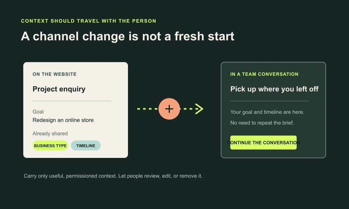
A channel handoff is one of the most fragile moments in a service. If someone starts online and continues with a person, they should not need to tell the whole story again. But continuity is not an excuse to collect or carry everything. Keep only information that is useful, appropriate, and permissioned.
Make the transition explicit: show what has been saved, what will be shared, and where the conversation continues. Give people a way to correct the record or choose another route. When a team member takes over, pass along the goal and relevant progress—not a raw transcript with no context.
Keep Convenience Human and Responsible
A seamless experience should not be a one-way door. People need to understand when automation is acting, how to interrupt it, and how to reach a person when the situation calls for judgment. Make the faster path optional when it excludes someone or removes meaningful control.
- Offer equivalent keyboard, touch, voice, and human-supported routes where they matter.
- Explain why sensitive information is needed before asking for it.
- Keep essential content available without relying on motion, audio, colour, or a single device.
- Respect quiet hours, notification preferences, and the person’s ability to pause or opt out.
- Provide a clear repair path when automation misunderstands, fails, or reaches its limits.
Good experience design does not make friction disappear indiscriminately. It removes needless effort while keeping the pauses, explanations, and confirmations that protect people.
Measure What People Experience
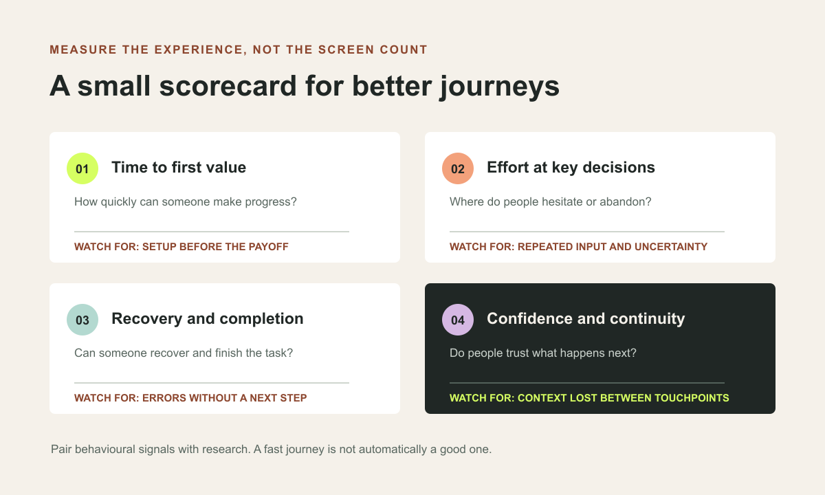
A screen-level metric can tell you where someone clicked. It cannot tell you whether their larger job became easier. Combine behavioural data with research and service evidence so the team understands both what happened and why.
- Time to first value: how long it takes to reach a useful result, not just finish onboarding.
- Decision effort: where people hesitate, backtrack, compare repeatedly, or ask for clarification.
- Recovery: whether someone can correct a mistake and complete the task.
- Continuity: how often information or progress is lost between channels and teams.
- Confidence: whether people understand the status, trust the next step, and know where to get help.
- Inclusive completion: whether people using different devices, abilities, and input methods can reach the same meaningful outcome.
Set a baseline before redesigning. Pair funnel and support data with task observation, interviews, and accessibility testing. Faster is useful only when the result is also clear, correct, and respectful.
A Practical Playbook for Product Teams
You do not need a new transformation programme to begin. Choose one journey that matters to customers and is causing visible effort for the business. Bring design, product, engineering, content, research, operations, and support into the same working session.
- Agree on the person, their situation, and the outcome they need.
- Map the current journey, including channels, backstage work, waiting, and failure paths.
- Mark the moments of uncertainty, repeated effort, abandonment, and unwanted handoff.
- Explore more than one intervention; a better screen is one option, not the only option.
- Prototype the connected journey, including recovery, accessibility, and human support.
- Test it with representative people and measure the outcome against a baseline.
- Ship in small steps, watch the service end to end, and improve the weakest moment next.
This process keeps a bold experience idea grounded in what the organisation can actually deliver. It also surfaces dependencies early, before a polished interface promises something the service cannot yet provide.
Experience Design Checklist
- Is the person’s real goal clear, beyond the screen or feature they requested?
- Does the map include what happens before, during, and after the digital interaction?
- Can people understand their options and the consequences of a decision?
- Does useful progress survive a pause, a mistake, or a channel change?
- Are privacy, accessibility, recovery, and human support designed into the journey?
- Does every notification or interaction arrive at a useful time and for a clear reason?
- Can the service team deliver the promise made by the interface?
- Are success measures tied to outcomes, effort, confidence, and inclusive completion?
The Future Is a Better Relationship with the Product
The future of UX is not a competition to put more interfaces into people’s lives. It is the patient work of understanding what they are trying to do, making the next step easier to trust, and connecting the service around them.
Sometimes that will mean a thoughtful new screen. Sometimes it will mean a clearer handoff, a more useful message, a better recovery path, or one less step. Start with the experience people need to have, then let the interface follow. Talk with Webx Design Studio about designing a more connected customer journey.
Frequently asked questions
Does better UX mean building fewer screens?
Not necessarily. It means making every interaction earn its place in a complete journey. Some tasks need a dedicated screen; others benefit from a notification, a saved preference, a human conversation, or no interface at all.
How do teams start designing beyond screens?
Start with a real user goal and map the journey before, during, and after the product interaction. Include channels, service operations, handoffs, failure states, and the information people need at each moment.
How can a team measure an end-to-end experience?
Combine task completion with time to first value, effort at key decisions, recovery from failure, continuity across channels, accessibility, and qualitative evidence about confidence and trust.